UX/UI design for WhatsCooking app
From chefs to restaurants, WhatsCooking have tools to help you start selling online. Create a free online store that syncs with their marketplace applications and social media to help you sell right away.
Project highlights
WhatsCooking is a versatile platform designed to assist individuals and businesses in the culinary industry, ranging from chefs to restaurants, in establishing an online presence and effectively selling their products and services.
I was approached by WhatsCooking to contribute to their app development process by creating a website version of their platform. At the time of their approach, their app was still in the development phase, and they sought assistance in expanding their services to include a web-based interface.
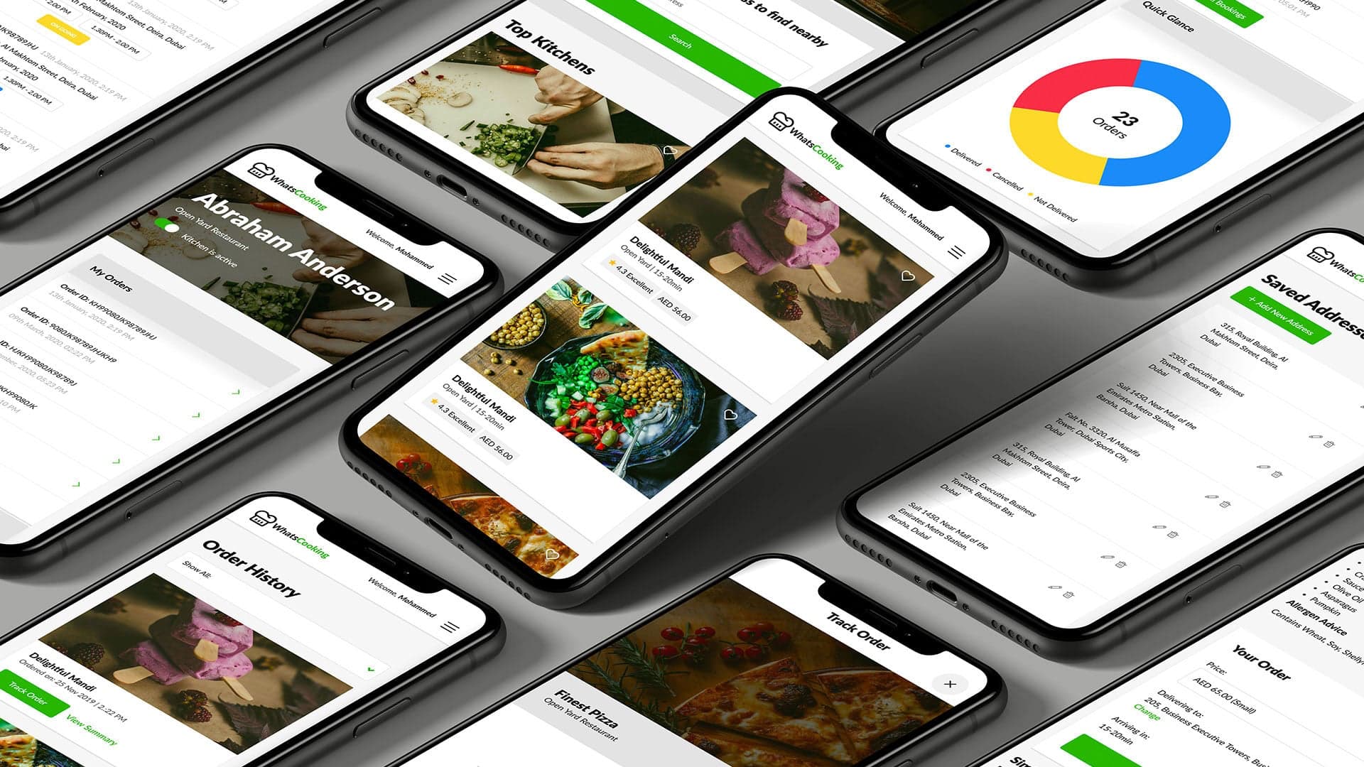
The mobile app offered by WhatsCooking plays a crucial role in empowering users to conveniently order food, create personalized kitchens, and even sell their own culinary creations. Additionally, the app provides a unique opportunity for talented chefs to showcase their skills and be booked for both corporate and personal events, enhancing their exposure and potential for new opportunities.
Project was based on four phases:
1. User Experience (UX)
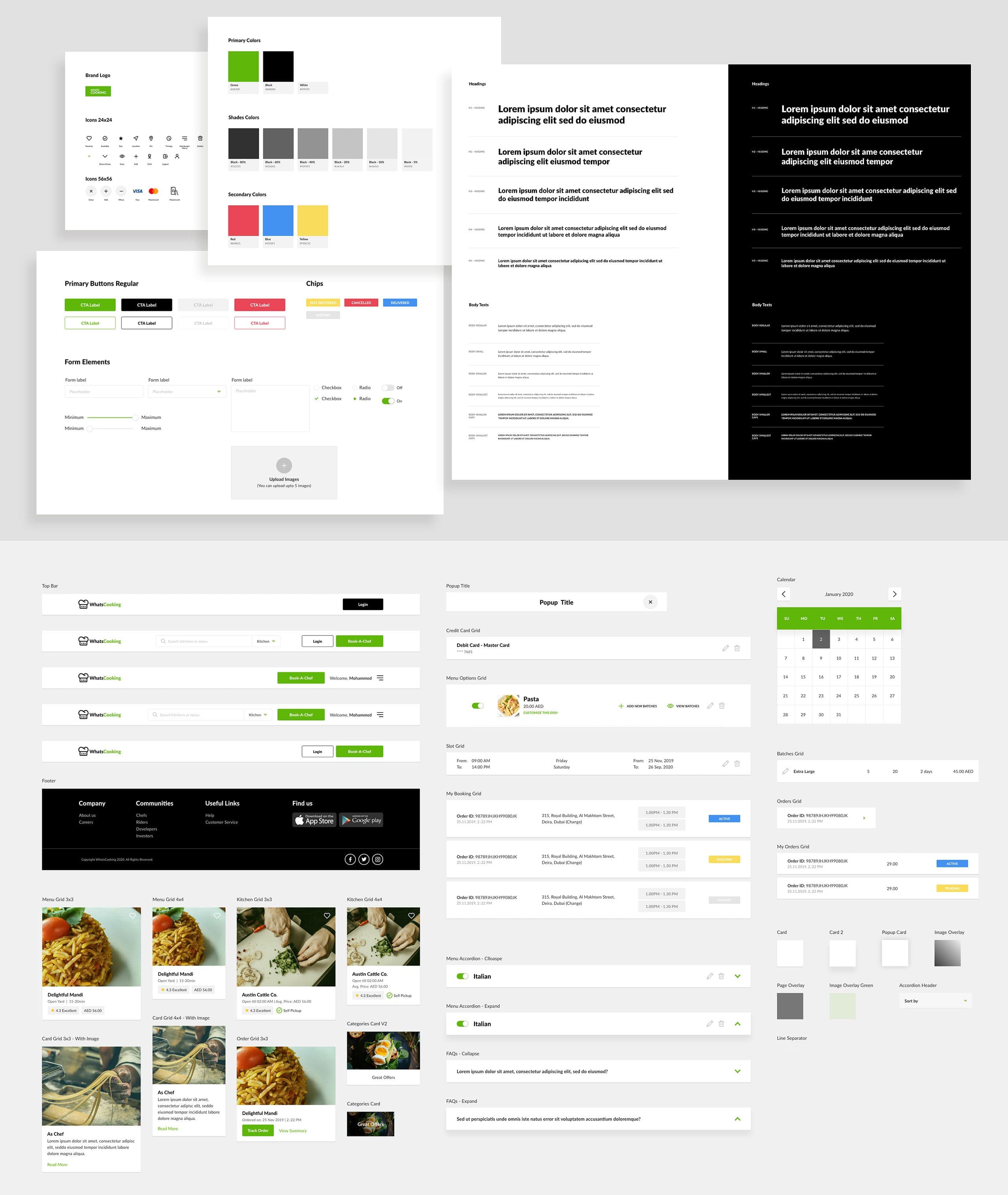
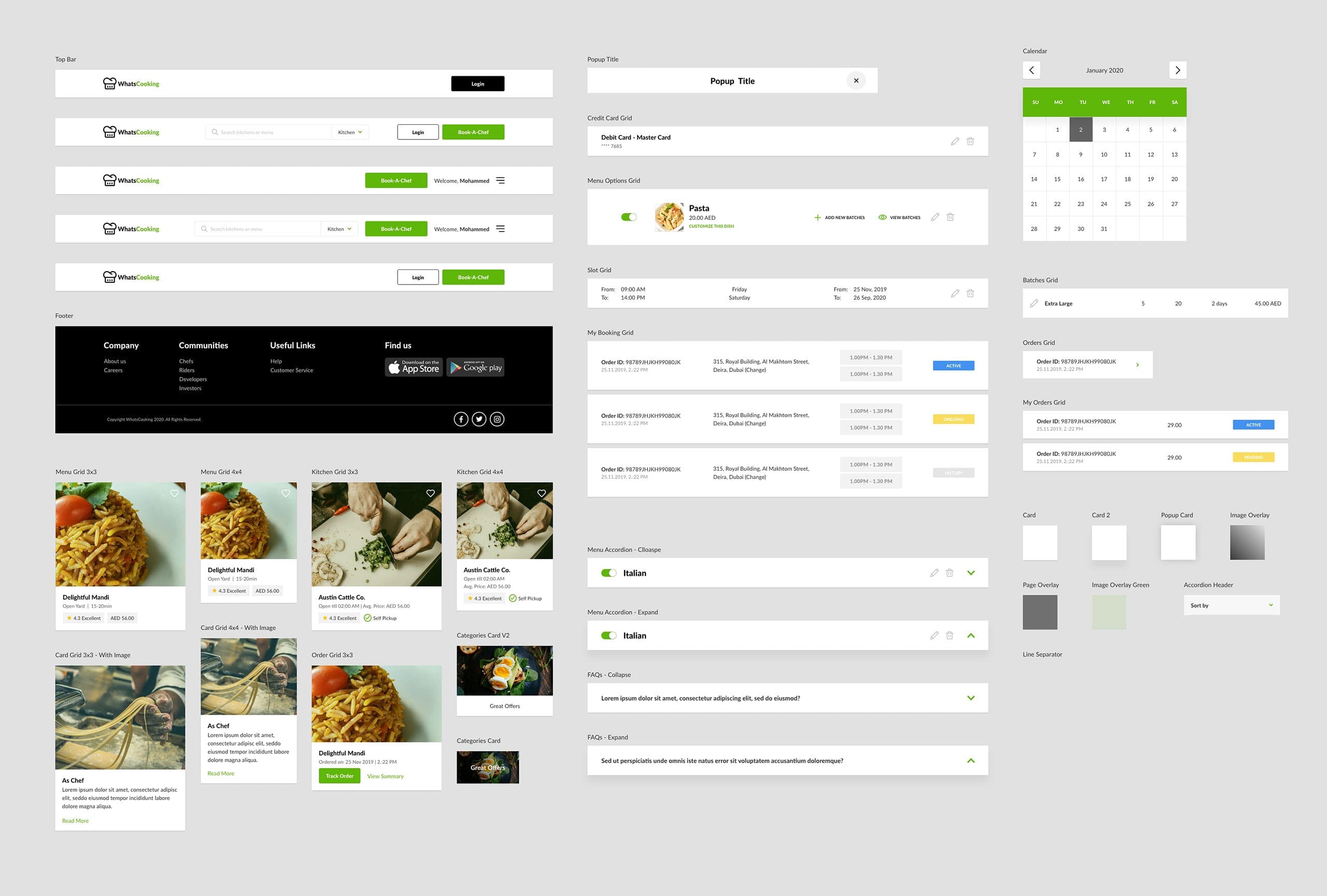
2. Design System Language
3. User Interface (UI)
4. Front-End Development
Existing app audit
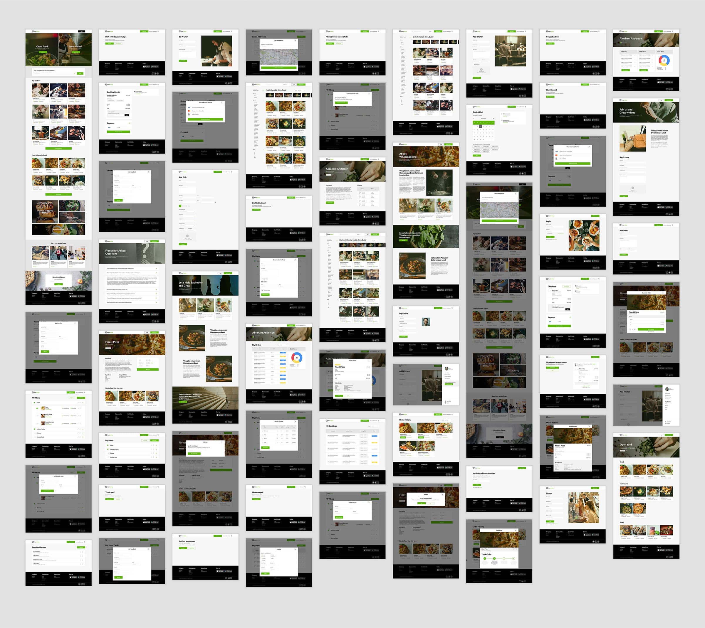
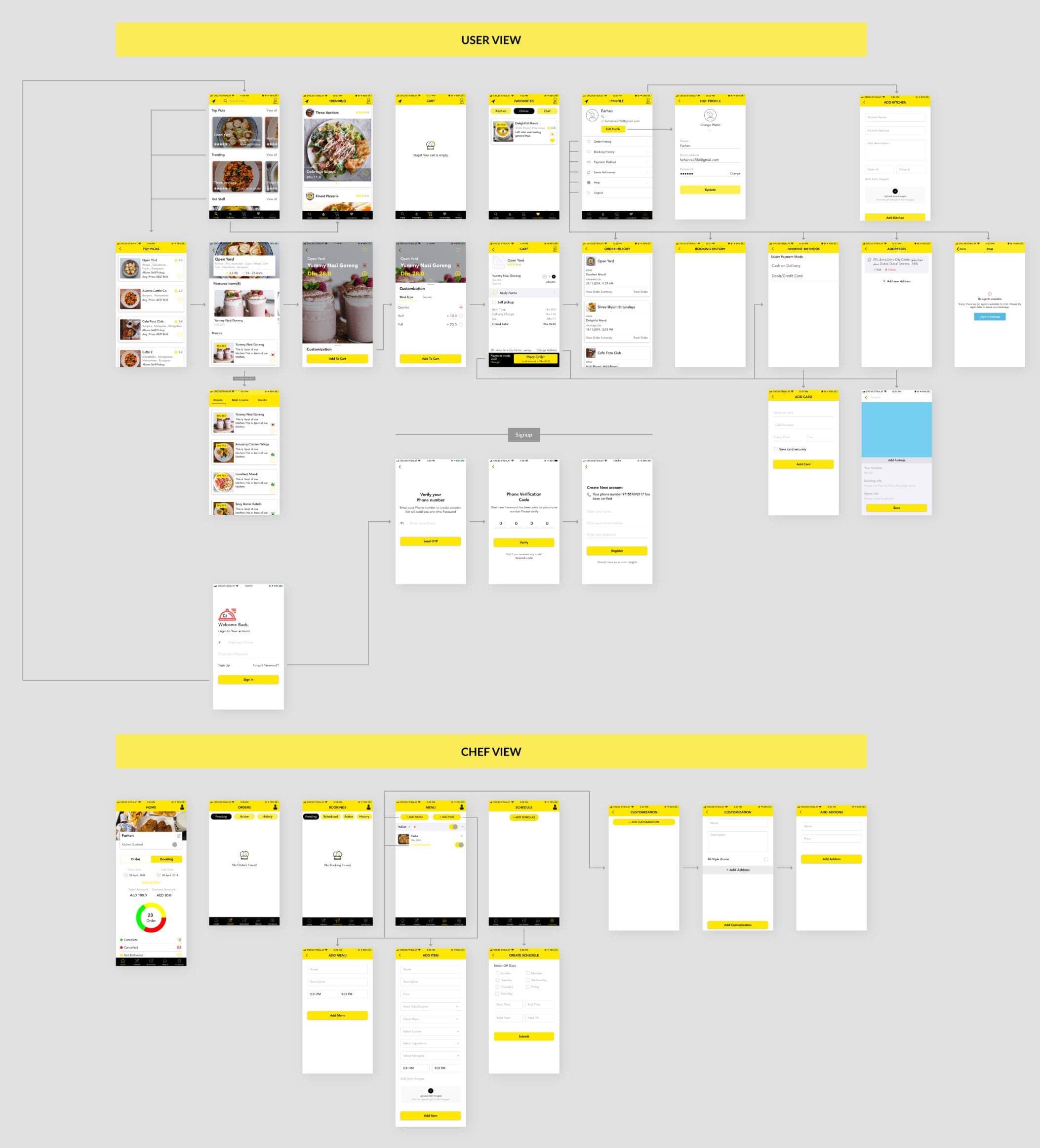
To initiate the project, I began by conducting a thorough audit of the existing app, immersing myself in the available information to grasp the client's progress thus far. As an initial step, I captured screenshots of all the app screens and used them to create a comprehensive user flow. This approach ensured that both the client and I were aligned and had a clear understanding of the current flow of the app.
User Experience (UX) phase
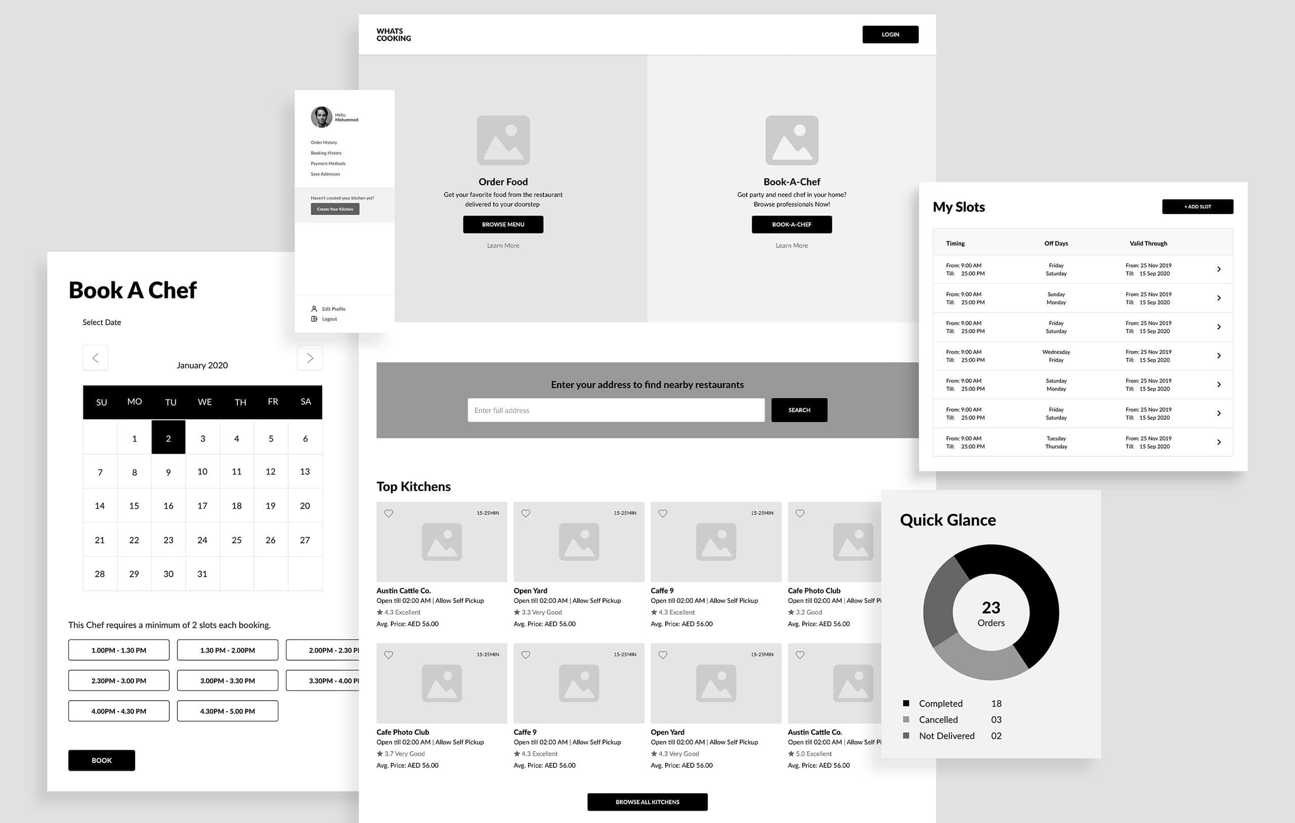
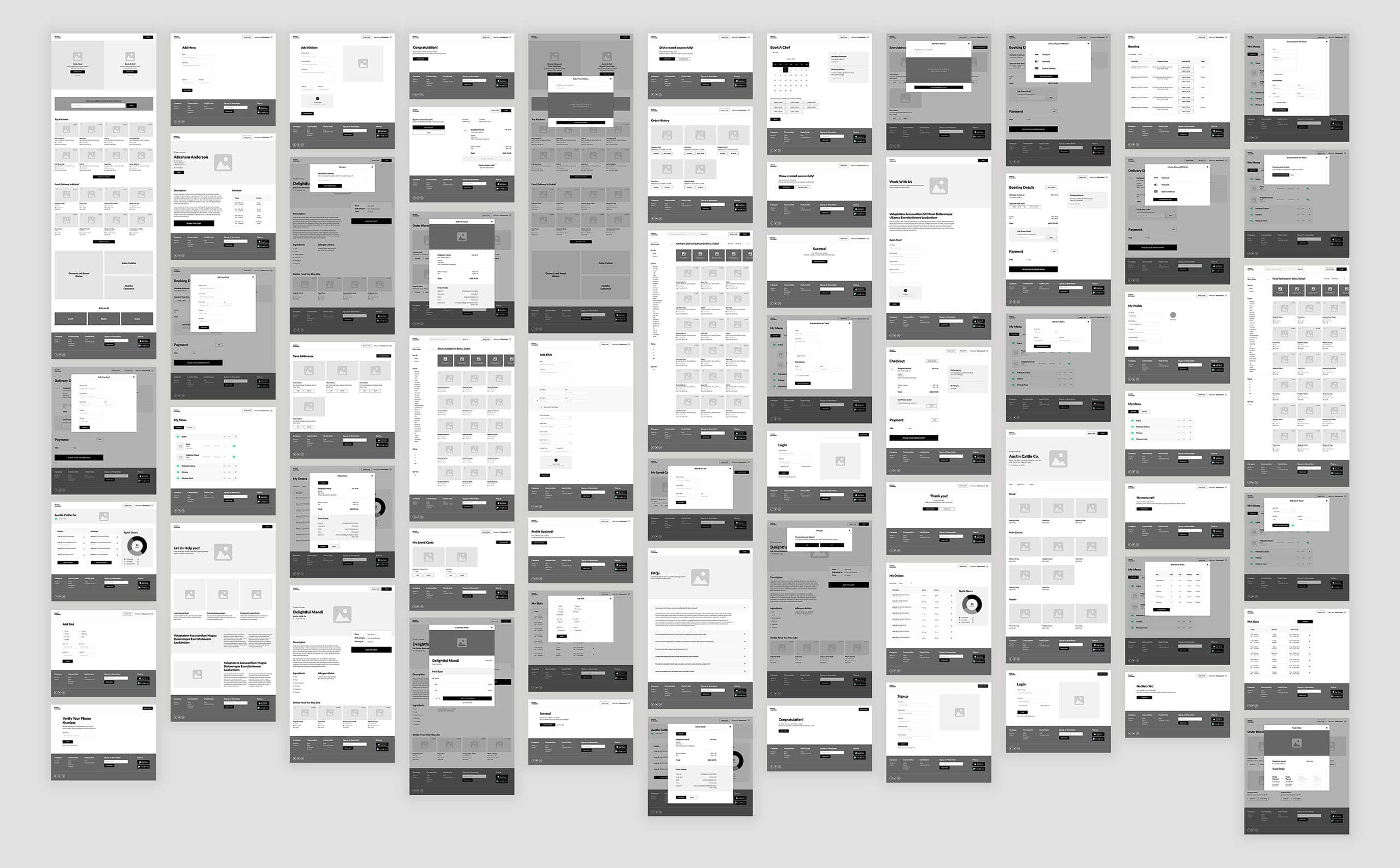
After the audit of the app, I began working on low-fidelity wireframes. Once I had established the basic flow, I then started working on high-fidelity wireframes.
My next step involved creating a clickable prototype using the high-fidelity wireframes. This interactive prototype allowed the client to navigate through the app and provide their feedback conveniently.
Design System Language
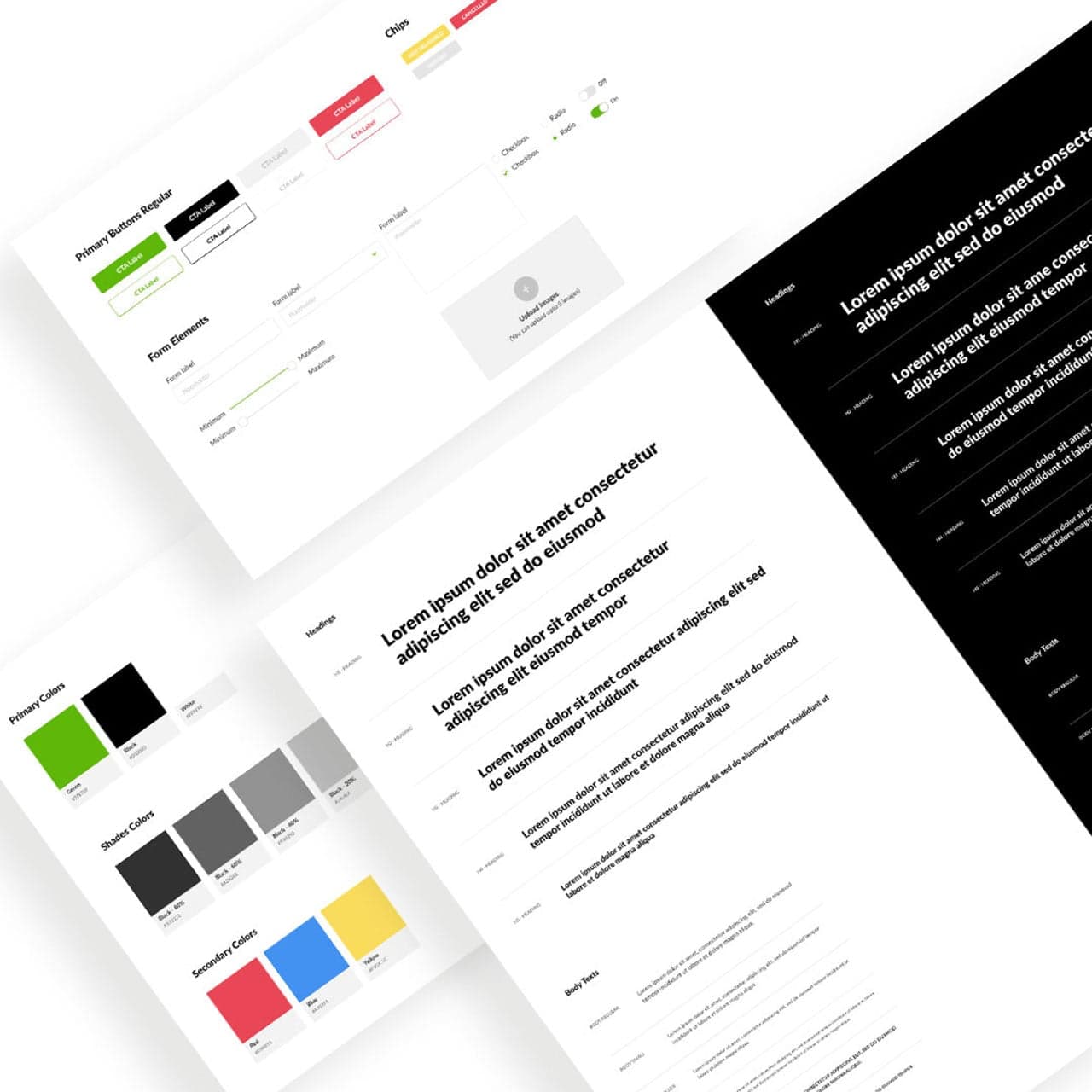
Recognizing the client's initial focus on website pages during the UX phase, I suggested implementing a design language system to ensure future scalability.
As a designer, it was my responsibility to provide forward-thinking solutions that would benefit the client in the long run. I engaged in discussions with the clients, outlining the advantages of adopting a design language system and explaining how it could effectively streamline their work processes in the future.
User Interface (UI) phase
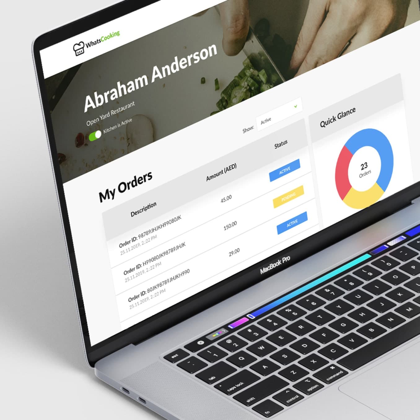
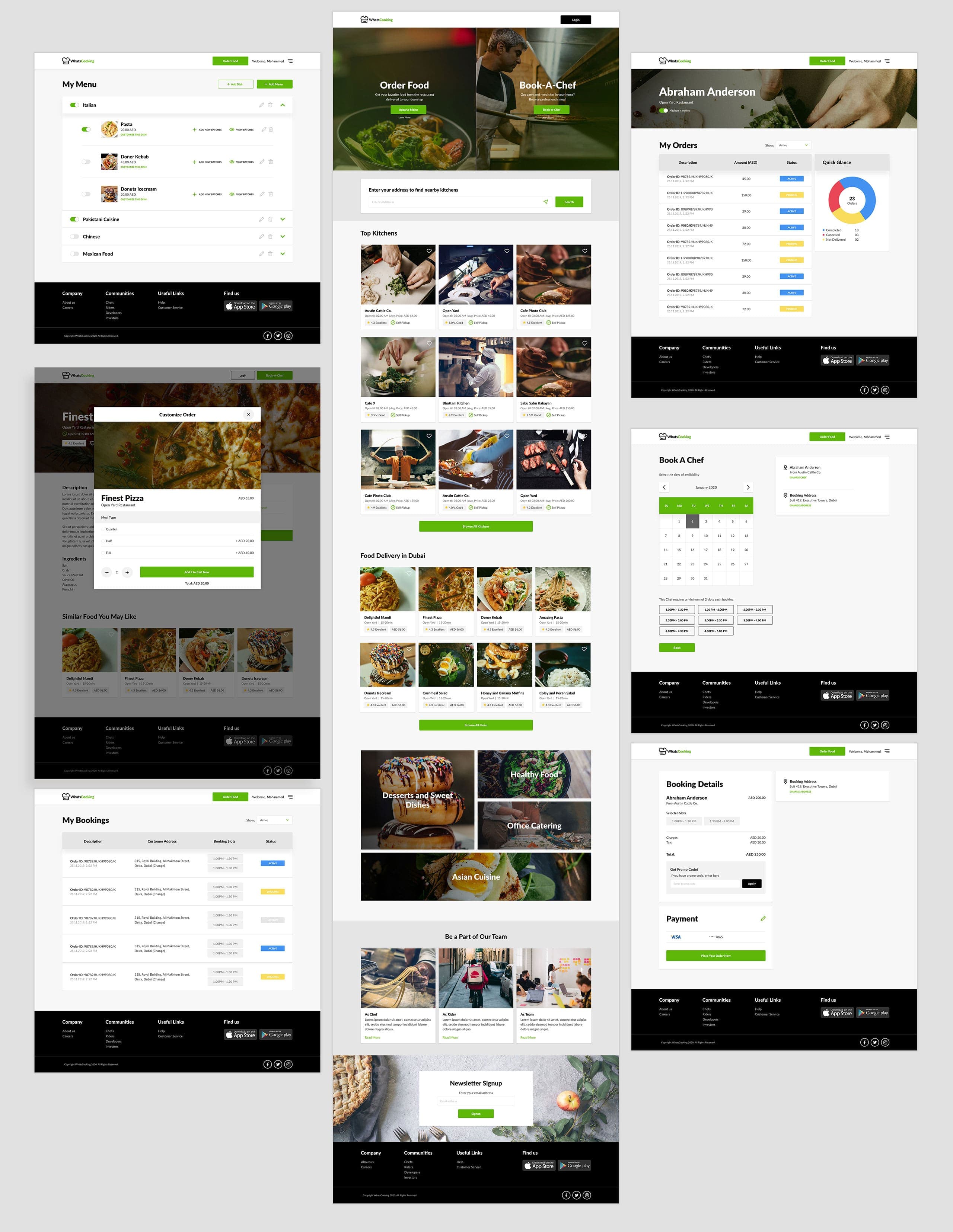
After the UX phase got the green light, I kicked off the design phase. The client wanted a design that looked neat, was easy to use, and made sense to everyone.
I had a brainstorming session with the client to understand what they wanted the website to look like. Then, I started working on a few pages to set the visual direction. Once the client liked what they saw, I went on to create the whole design system for all the pages needed on the website.
